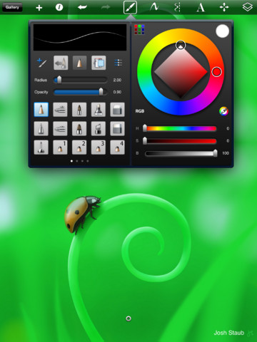
I might be a few days late on this but Paper is an iOS app that seems to have garnered a massive amount of hype recently.
At first glance the app does look beautiful and takes a simple approach in design and usablility. However, once you get past the beauty/hype you realize the app is basically worthless. Looks like they were able to con millions of people into paying for upgrades and not a single one of them are worth even 99 cents or $1.99 or whatever they may be.
I was almost tempted at first to grab one of the tools for $1.99 since it initially only comes with a single fountain pen. But I quickly stopped myself. Then I downloaded Autodesk SketchBook Express. Now this is a drawing program. It comes with a ton of tools to start and the upgrades seem decent. For example, you can buy a pack of 15 pencils plus 15 brushes for 99 cents vs $1.99 for a SINGLE pencil in Paper.
The Paper app doesn’t even support landscape mode and their marketing is
around notebooks. I don’t have any notebooks that only work in landscape mode. There are no layering tools in Paper. There are a ridiculously limited 8 crappy colours available in Paper. Sketchbook is virtually unlimited.
You really can’t compare the two apps. Paper isn’t even worth the free download if you ask me and Sketchbook is worth paying for the Full version or just grab the free version that is 1000 times better than Paper.
Just goes to show you that these days you can still get away with putting out some fluffy nice looking stuff and somehow get the hype machine to make you millions.


1 response so far ↓
1 Al K // Apr 11, 2012 at 2:33 pm
Totally agree. I did exactly the same thing…play around with Paper and then look for something better with more built-in features.
While Paper has a nice feel to it…I’m not paying for extra brushes and whatnot when Sketchbook exists.
Leave a Comment